This is a motherfucking website.
And it's fucking perfect. You probably build websites and think your shit is special. You think your 13 megabyte parallax-ative home page is going to get you some fucking Awwward banner you can glue…
You May Also Like

3D in CSS
How to create a 3D space using CSS. How to use the CSS perspective property. How to translate & rotate an element in 3D space using CSS. Use cases for the CSS perspective property.
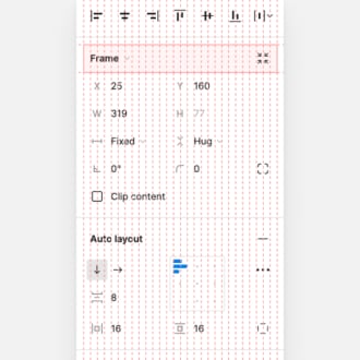
The CSS behind Figma
A look at some interesting use-cases for CSS flexbox and grid in Figma app.

The evolution of scalable CSS
A deep dive into the problems with scaling CSS on large projects. Understand the evolution of CSS best practices.

OKLCH in CSS: why we moved from RGB and HSL—Martian Chronicles, Evil Martians’ team blog
CSS Color Module 4 adds oklch(), and we gain P3 wide-gamut support, boost code readability, and improve developer-designer communication.

My favourite 3 lines of CSS
In Every Layout, we wrote about The Stack. It’s a marriage of Heydon’s Lobotomised Owl selector and my method of managing Flow and Rhythm with CSS Custom Properties. .stack > * + * { margin-bloc…
What is Refind?
Every day Refind picks the most relevant links from around the web for you. Picking only a handful of links means focusing on what’s relevant and useful. We favor timeless pieces—links with long shelf-lives, articles that are still relevant one month, one year, or even ten years from now. These lists of the best resources on any topic are the result of years of careful curation.
How does Refind curate?
It’s a mix of human and algorithmic curation, following a number of steps:
- We monitor 10k+ sources and 1k+ thought leaders on hundreds of topics—publications, blogs, news sites, newsletters, Substack, Medium, Twitter, etc.
- In addition, our users save links from around the web using our Save buttons and our extensions.
- Our algorithm processes 100k+ new links every day and uses external signals to find the most relevant ones, focusing on timeless pieces.
- Our community of active users gets the most relevant links every day, tailored to their interests. They provide feedback via implicit and explicit signals: open, read, listen, share, mark as read, read later, «More/less like this», etc.
- Our algorithm uses these internal signals to refine the selection.
- In addition, we have expert curators who manually curate niche topics.
The result: lists of the best and most useful articles on hundreds of topics.
How does Refind detect «timeless» pieces?
We focus on pieces with long shelf-lives—not news. We determine «timelessness» via a number of metrics, for example, the consumption pattern of links over time.
How many sources does Refind monitor?
We monitor 10k+ content sources on hundreds of topics—publications, blogs, news sites, newsletters, Substack, Medium, Twitter, etc.
Can I submit a link?
Indirectly, by using Refind and saving links from outside (e.g., via our extensions).
How can I report a problem?
When you’re logged-in, you can flag any link via the «More» (...) menu. You can also report problems via email to hello@refind.com
Who uses Refind?
450k+ smart people start their day with Refind. To learn something new. To get inspired. To move forward. Our apps have a 4.9/5 rating.
Is Refind free?
Yes, it’s free!
How can I sign up?
Head over to our homepage and sign up by email or with your Twitter or Google account.