Daten-Visualisierung | Data Visualization
Everything Data & Visual: Know-how, How-To & Best Practices.
Collection by Stephanie A Kowalski


The New York Times
What Happened When Trump Was Banned on Social Media
8 min · · Since Facebook and Twitter banned him, Donald J. Trump, the former president, has posted statements online far less often. But some of his statements have traveled just as far and wide on social… · Shared by 82, including Thomas Power, Klaus Eck, William Gibson, Dan Froomkin (PressWatchers.org), Glenn Greenwald, Kevin Roose, Stephanie A Kowalski, Matt Navarra, feilding cage, Craig Brown, PhD, Jay Rosen, Mathew Ingram, Digg


Visual Capitalist
A Map of the Online World in Incredible Detail
10 min · · View the giant full-size (20 MB) version of this map. · Shared by 72, including Theodora (Theo) Lau - 劉䂀曼 🌻, Prof. Sally Eaves, Gisele Navarro, Brad Geddes, Stephanie A Kowalski, Nicolas Babin, AI, 𝙎𝙝𝙚𝙡𝙡𝙮 𝙎𝙖𝙣𝙘𝙝𝙚𝙯 💡, John Nosta, Dr. James Canton


hyperallergic
A Data Artist’s Guide to Putting People (and Privacy) First
3 min · · With Living In Data, Jer Thorp demonstrates the importance of enabling people to participate in the process of creating and telling the stories behind data. · Shared by 49, including Jer Thorp, Stephanie A Kowalski, Hrag


Big Think
Why Swiss maps are full of hidden secrets
20+ min · · Cartography is serious business in Switzerland — but once in a while, the occasional map gag slips through. · Shared by 164, including Stephanie A Kowalski, Jane, Jennifer Ouellette


Open Culture
The Open Syllabus Project Visualizes the 1,000,000+ Books Most Frequently Assigned in College Courses
2 min · · The Prince, The Canterbury Tales, The Communist Manifesto, The Souls of Black Folk, The Elements of Style: we've read all these, of course. Or at least we've read most of them (one or two for sure),… · Shared by 154, including Eva Keiffenheim, Stephanie A Kowalski, Mike Tamir, PhD, Fern


Fast Company
The untold story of how Florence Nightingale used data viz to save lives
3 min · · Nightingale was a fierce advocate of public health—and she used sophisticated graphic design to make her case. · Shared by 188, including Carla Gentry 🎶, Stephanie A Kowalski, 🇺🇦Evan Kirstel #B2B #TechFluencer, Gabriele, Theodora (Theo) Lau - 劉䂀曼 🌻, John Nosta, Brooks Rainwater, RJ Andrews, LARRY ELKAN


Data Visualization Society
Visualizing Environmental Action
17+ min · · How I visualized United Nations data on environmental treaties · Shared by 20, including Katja Evertz, Stephanie A Kowalski

Content Marketing Institute
Transform Your Data Into Great Visuals With These Resources, Tips, and Tools
6 min · · Visualizing data is a great way for brands that have access to original research to get attention and earn credibility – Content Marketing Institute · Shared by 99, including Construct Marketing, Julie Ewald, Stephanie A Kowalski


The Pudding
Making Internet Things, Part 3: Storytelling
16+ min · · This is the third installment of a multi-part series designed to help you familiarize yourself with the tools used to make visual, data-driven essays. · Shared by 79, including Robin Kwong, Stephanie A Kowalski, Marie-José Kolly, Tom Connor, Oscar MacDonald, Nrupal Akolkar

The Pudding
Making Internet Things, Part 2: Design
6 min · · This is the second installment of a multi-part series designed to help you familiarize yourself with the tools used to make visual, data-driven essays. · Shared by 19, including Oscar MacDonald, Stephanie A Kowalski, Fabricio Teixeira

The Pudding
How to Make Dope Shit, Part 1: Working with Data
7 min · · This is the first installment of a multi-part series designed to help you familiarize yourself with the tools used to make visual, data-driven essays. · Shared by 23, including Cameron Yick ~ @hydrosquall@vis.social on mastodon, Oscar MacDonald, Stephanie A Kowalski, @felixmichel@vis.social


PLOS
Using control charts to understand community variation in COVID-19
18+ min · · Decision-makers need signals for action as the coronavirus disease 2019 (COVID-19) pandemic progresses. Our aim was to demonstrate a novel use of statistical process control to provide timely and… · Shared by 17, including Stephanie A Kowalski, Ian Johnson 💻🔥


Observable
Simplex Stacks
· You may have heard of Simplex Noise, you can find many amazing visuals using it on Observable. But have you ever seen a stacked area chart of Simplex noise? This notebook does just that, using Plot to… · Shared by 41, including Katja Evertz, Mike Bostock, Stephanie A Kowalski, Ian Johnson 💻🔥

Observable
Observable Plot
· Observable Plot is a free, open-source JavaScript library to help you quickly visualize tabular data. It has a concise and (hopefully) memorable API to foster fluency — and plenty of examples to learn… · Shared by 244, including Zan, Balda, Yoav Ganbar (🥑 Builder.io/Qwik), Mike Bostock, Kevin Marks 🏠kevinmarks.com xoxo.zone/@KevinMarks, Ben Jones, Benjamin Wiederkehr, Stephanie A Kowalski, Kaspar Manz, Ⓓarío Macchi, Nando 💪🇦🇺🇦🇷, Mark Kaigwa, Follow me on Bluesky or Mastodon (see below), Maarten Lambrechts @maarten@vis.social, Jerome Cukier, Ian Johnson 💻🔥, @JanWillemTulp@vis.social


Interactive Things
Data Visualization for Exploration and Explanation
· Inspiration and guidance for balancing exploratory and explanatory approaches to communicate with data. · Shared by 81, including Stephanie A Kowalski
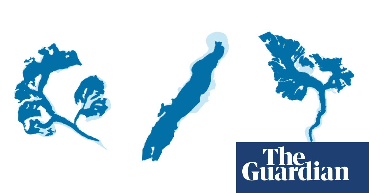

Guardian Environment
Visualised: glaciers then and now
5 min · · Explore an interactive database that reveals how the climate crisis is reshaping glaciers around the world · Shared by 111, including Nathan Yau, Niko Kommenda, Christian Hartmann, Stephanie A Kowalski