


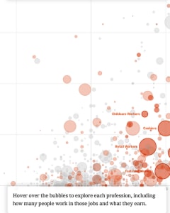
Bloomberg Graphics
2020 in Graphics
· To continue, please click the box below to let us know you're not a robot. · Shared by 85, including Maarten Lambrechts @maarten@vis.social, Oscar MacDonald, Stephanie A Kowalski, Javi Cantón @javicanton@mas.to, Katja Evertz, Gabriele, Rachael Dottle

martinheinz.dev
History of Epidemics in a Single Chart
12+ min · · Epidemics and Pandemics are still a hot topic so let’s visualize their history using interactive horizontal bar chart and D3.js! · Shared by 13, including Brian Ahier, MIT CSAIL, Javi Cantón @javicanton@mas.to


Towards Data Science
8 Tips for Better Data Visualization
20+ min · · Practical Advice for Improving Your GGPlot · Shared by 8, including Javi Cantón @javicanton@mas.to

blog.pacific-content.com
I tracked Apple’s Top 200 Podcasts for two years. Here’s what I found.
4 min · · Double the chart data. Double the fun. · Shared by 30, including Chris Messina, Javi Cantón @javicanton@mas.to


Jon Schwabish
Better Data Visualizations: A Guide for Scholars, Researchers, and Wonks
1 min · · My forthcoming book, Better Data Visualizations: A Guide for Scholars, Researchers, and Wonks, is now available on Amazon and other booksellers! · Shared by 78, including Stephanie A Kowalski, Follow me on Bluesky or Mastodon (see below), rohit, Mirko Lorenz, Thomas Power, Javi Cantón @javicanton@mas.to, Katja Evertz


EL PAÍS
Florence Nightingale, cuidados desde el Nilo
5 min · · Rebelde, viajera y considerada la primera enfermera profesional, esta aventurera desafió los convencionalismos victorianos del siglo XIX · Shared by 12, including Javi Cantón @javicanton@mas.to, El Viajero

Towards Data Science
What’s Wrong with COVID-19 Data Visualizations, and how to fix it
7 min · · Since the beginning of the Coronavirus outbreak I have been puzzled at the way data is presented to us by the media and even specialists. · Shared by 5, including Javi Cantón @javicanton@mas.to


DataJournalism.com
Simulating a pandemic
7 min · · The most-read piece on The Washington Post's website visualised how diseases like COVID-19 spread and how to flatten the curve. · Shared by 33, including Fabrizio Bianchi, Adam Thomas, Javi Cantón @javicanton@mas.to

EL PAÍS
Cómo el confinamiento frena la cadena de contagios
5 min · · Esta medida tiene como objetivo reducir el número de contactos diarios de una persona y bajar así el número reproductivo de la enfermedad. Y parece que lo está consiguiendo · Shared by 8, including Javi Cantón @javicanton@mas.to


National Geographic
How some cities ‘flattened the curve’ during the 1918 flu pandemic
3 min · · Social distancing isn’t a new idea—it saved thousands of American lives during the last great pandemic. Here's how it worked. · Shared by 406, including Kevin Kruse, Richard Deitsch, PNASNews, Tim O'Reilly, Horace Dediu, Michael Clemens, Nick Szabo, Elad Gil, Katja Evertz, Gregg Gonsalves, A C Grayling #FBPE #Reform #Rejoin #FBPR, Harpreet Singh, Brian D. Earp, Ph.D., Rasu Shrestha MD MBA, 🇺🇦Evan Kirstel #B2B #TechFluencer, Carl Zimmer, Josep M. Ganyet, AntonioMaestre, Thomas Power, MΛRC VIDΛL


The New York Times
Location Data Says It All: Staying at Home During Coronavirus Is a Luxury
7 min · · As the virus continues to spread throughout the nation, an analysis of cellphone data shows that those in the wealthiest areas have been able to reduce their movements more than those in the poorest… · Shared by 124, including Martin Stabe, Hiroko Tabuchi, Cameron Yick ~ @hydrosquall@vis.social on mastodon, Human Rights Campaign, Michael Carroll, Nando 💪🇦🇺🇦🇷, Thomas Power, Christina Farr, Josh Bersin, Javi Cantón @javicanton@mas.to, Deborah Blum, Undark Magazine, Patrick Stotz, Mark Kaigwa, Fred Scharmen


FiveThirtyEight
Why It’s So Freaking Hard To Make A Good COVID-19 Model
12+ min · · Here we are, in the middle of a pandemic, staring out our living room windows like aquarium fish. The question on everybody’s minds: How bad will this really ge… · Shared by 311, including Kirk Borne, Ed Yong has left The Atlantic, Martin Fowler, Marie-José Kolly, Dr. Ganapathi Pulipaka 🇺🇸, Julia Wolfe, Mike Tamir, PhD, Amesh Adalja, Damian Gryski, Anne Thompson, Kainaz Amaria, Carly, Javi Cantón @javicanton@mas.to, Ella Koeze, Ken Norton, Rachael Dottle, AGI.Eth | MTL.Eth, Jennifer Ouellette, Bethany Brookshire, Oliver Roeder


ZDNET
Tableau makes Johns Hopkins Coronavirus data available for the rest of us
7 min · · Tableau takes Hopkins' Coronavirus data, preps it and makes it available to all interested parties, in dashboard, Tableau data set, Google Sheet and CSV formats. · Shared by 143, including Craig Brown, PhD, Nige Roberts-Willson, Katja Evertz, Thomas Power, Fabrizio Bianchi, Javi Cantón @javicanton@mas.to, Ben Collins, Brian Solis, René Clausen Nielsen, 🇺🇦Evan Kirstel #B2B #TechFluencer, Ronald van Loon, Tom Connor, Bjorn Larsen


Robert Kosara
In Praise of the Diagonal Reference Line
2 min · · Annotations are what set visual communication and journalism apart from just visualization. They often consist of text, but some of the most useful annotations are graphical elements, and many of t… · Shared by 66, including Lisa Charlotte Muth, Javi Cantón @javicanton@mas.to, Thomas Power, Evan Sinar, PhD, Andy Cotgreave, Tom Connor, Fabrizio Bianchi, Follow me on Bluesky or Mastodon (see below)

Data Visualization Society
Thirteen Things to Visualize About COVID-19 Besides Case Loads
6 min · · Using peripheral data sets to better understand our new normal · Shared by 8, including Javi Cantón @javicanton@mas.to

The New York Times
How the Virus Got Out
7 min · · We analyzed the movements of hundreds of millions of people to show why the most extensive travel restrictions to stop an outbreak in human history haven’t been enough. · Shared by 974, including Chris Fralic, Eric Topol, 艾未未 Ai Weiwei, zooko❤ⓩ🛡🦓🦓🦓, Kevin Roose, Carl Zimmer, Christopher Mims 🤌, Jon Matonis, Renee DiResta, Niall Ferguson, Matt Goodwin, Carla Gentry 🎶, Johnny Harris, Mathew Ingram, Dr. Manu Kumar, Azeem Azhar, R.NFT R “Ray” Wang 王瑞光 #1A #AI, Stefan Ottlitz @hierprivat@mastodon.social, hardmaru, Aral Balkan